Building SimpleMark: A Product & Engineering Case Study
At a glance
- What it is: A multi-tenant business management platform for independent professionals, with five integrated modules covering strategy, work, clients, marketing, and finances.
- My role: All of it, alone: product, UX and UI design, architecture, and full-stack development.
- Timeline: About ten months from concept (August 2025) to soft launch (June 2026).
- Scale: 5 modules, 76 initial user stories, 156 components and 32 pages, in English, Hebrew (with full right-to-left support), and Russian.
- Stack: React, TypeScript, Vite, Node.js, Express, PostgreSQL, Prisma.
- Status: Live since June 2026, pre-revenue. Try it
- What's below: How I decided what to build and what to cut, how the system fits together, and what went wrong along the way.
1. Overview
SimpleMark is a business management platform. Five integrated modules cover strategy, operations, clients, finances, and marketing, built to replace the ten-to-fifteen disconnected tools most independent professionals end up running their business across.
I built it alone: product decisions, UX/UI, architecture, and code. This case study walks through how it got built, the research that shaped the scope, the technical decisions and trade-offs behind them, what broke along the way, and what I'd do differently with the experience I have now.
It wasn't a straight line, and the order matters. Concept came first, then a mind map, database models, backend CRUD, and a rough frontend skeleton. Then I stopped development on purpose and went back to UX, wireframed better screens, designed the UI, and only then returned to the frontend, fixing bugs and adding features along the way. That order, and the decision to stop and redo it, is as much the subject of this case study as the product is. In calendar terms, it was roughly ten months from concept to soft launch:
| When | What |
|---|---|
| August 2025 | Concept and mind map |
| September 2025 | First drafts of the data models |
| October 2025 | Backend rewritten from Flask to Express |
| November 2025 to February 2026 | Development and design work |
| March to May 2026 | Bug fixing, feature implementation, QA |
| June 2026 | Soft launch |
| July 2026 | Public announcement |
A multi-tenant web app with this much design and this many features usually takes a whole team:
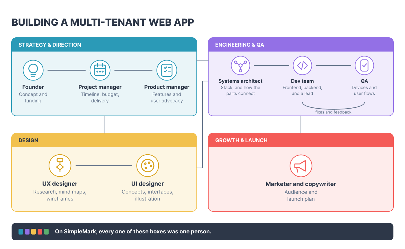
- A founder with the concept and the money to fund it
- A project manager to keep everyone focused and deliver on time, on budget, and in the right way
- A product manager to own the features and advocate for the user
- A dev team of frontend and backend developers, with a lead who makes sure everyone knows what they're doing
- A systems architect who picks the right stack and shows how the parts connect
- A UX designer for mind mapping, research, and wireframes
- A UI designer for concepts, interface building, and illustration
- QA to test devices and user flows
- A marketer and copywriter to warm up the audience and plan the launch
I've worked with people in every one of those roles, so I know how it works in real life. This time I had to do all of it on my own. It was hard, it took a long time, and I loved it.
It's written from every seat I sat in, and two of them pulled against each other more than the rest: the product manager who has to decide what to build, why, and for whom, and the developer who has to build it. Most case studies pick one lens. I believe the more honest and more useful version shows all of them, including where they pulled against each other. I'm deliberately leaving out the details of parts of my work like marketing, the financial side of things, and personal motivations. Maybe I'll write a new article about that as well in the future.
2. The problem
Individual professionals, freelancers, and small service businesses do not lack tools. They have too many. A typical setup spans a CRM for clients, a separate invoicing tool, a project tracker, a notes app for strategy that nobody revisits, spreadsheets for finances, and a scattering of templates for anything client-facing. Each tool solves a narrow slice of the business and holds its own slice of the truth.
I'd lived this problem myself, running a consulting practice, before I ever tried to solve it as a product. The pattern I kept seeing, in my own work and in conversations with others like me, wasn't a discipline problem. It was a problem of structure and logistics: nothing on the market modeled a business. How it runs, what it needs, what it doesn't. Products on the market were brilliant, but each solved one particular problem and created another headache for the user.
The audience I was building for stayed pinned next to my desk the whole time, not as an abstraction, but as something I actually checked decisions against:
Who they are. Solo operators who sell a craft, not a company: designers, developers, coaches, consultants, photographers, copywriters, small creative agencies, independent sellers. Real clients, real skill, no team, no formal business training. Roughly two groups: freelancers who don't yet see themselves as a "business," and solopreneurs already trying to build something real.
What they want. To spend time on their actual craft, not admin. To feel like a legitimate business, not gig work with extra steps. A real answer to "how's my business doing" instead of a gut feeling. Systems that don't require becoming a project manager just to run them.
What they struggle with. Losing roughly two workdays a week to admin. Too many disconnected tools, not too few. No cash-flow visibility until it's a crisis. No one to sanity-check a decision alone. Staying stuck as a "freelancer" because nothing treats their work like a real business. Generic advice fatigue, checklists that ignore what it's actually like to be alone in this.
I looked at what existed and mapped the gap directly:
- Bonsai and Dubsado go deep on the client-delivery pipeline: contracts, e-signatures, invoicing that fires the moment a contract's signed. Nothing for planning the business behind that pipeline.
- HoneyBook bundles a proposal, contract, and invoice into one client-facing flow. Strong at that specific transaction, not built to think past it.
- Indy and Plutio come closer to a full toolkit, but neither puts a strategy or marketing layer next to the actual client work.
- 17hats and Moxie lean into heavy automation and multi-tier portals, built for high-volume standardized work, not a consultant whose scope changes with every client.
- Notion, ClickUp, and Airtable are infinitely flexible and carry a hidden tax for it: you become the software administrator for your own business, one broken formula or Zapier integration at a time.
None of them answer the actual question a solopreneur needs answered day to day: where does my business live? People weren't spending their time on their craft. They were spending it administrating a pile of tools that didn't talk to each other.
3. Discovery and research
Before SimpleMark existed as software, I ran two earlier products that failed, and I treat both as research rather than as false starts.
The first was a set of Etsy-listed digital products: React website templates, a full client email package (onboarding through delivery, in multiple tones), and complete branding packages covering everything from social templates to business decks. All of it was built on an assumption I hadn't tested, that solopreneurs wanted to buy packaged expertise. I made multiple products and had exactly one sale. That result was data. It told me the packaged-template model wasn't where the actual pain was.
The second was a Notion-based business planner, which did better, not commercially, but directionally. It suggested people responded to something that modeled their whole business, not a single deliverable. That's the insight that became the SimpleMark Framework: how the modules interact with each other, and why they work the way they do.
Alongside both of these, I spent real time in solopreneur-adjacent spaces on Reddit and various forums, reading what people were frustrated or annoyed about in the tools they used. One pattern showed up consistently: people didn't want more configuration. They wanted less. Every tool that promised flexibility handed them a blank canvas and expected them to become their own systems designer on top of running their craft. That single insight shaped a core product principle I carried into every scope decision that followed: don't make the user configure the thing before it's useful.
4. Defining scope
The five modules aren't a method I imposed on a business. They're what any business consists of: where it's headed, how the work gets done, who it serves, how it's seen, and what keeps it running. Each one got a job:
- Clarity: strategy and direction. Set your vision, map your goals, and keep your high-level priorities on track.
- Flow: work and operations. Stay locked in on active deliverables with Focus Mode, live timers, and distraction-free task management.
- Trust: client relationships. A self-service link that onboards leads, schedules calls, and feeds client details directly into your workspace.
- Presence: marketing and visibility. Plan your public messaging, organize content ideas, and schedule your outreach in the same hub.
- Foundation: money and infrastructure. Send invoices, manage rates, and track revenue linked directly to your active project work.
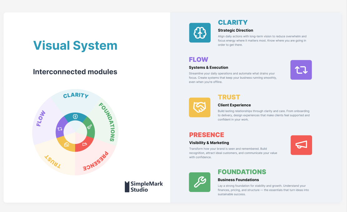 The finished module system, mapped to what each one owns.
Turning five modules into an actual product meant defining the information architecture before any UI existed: what lives under each module, what the sub-pages are, how deep each one goes.
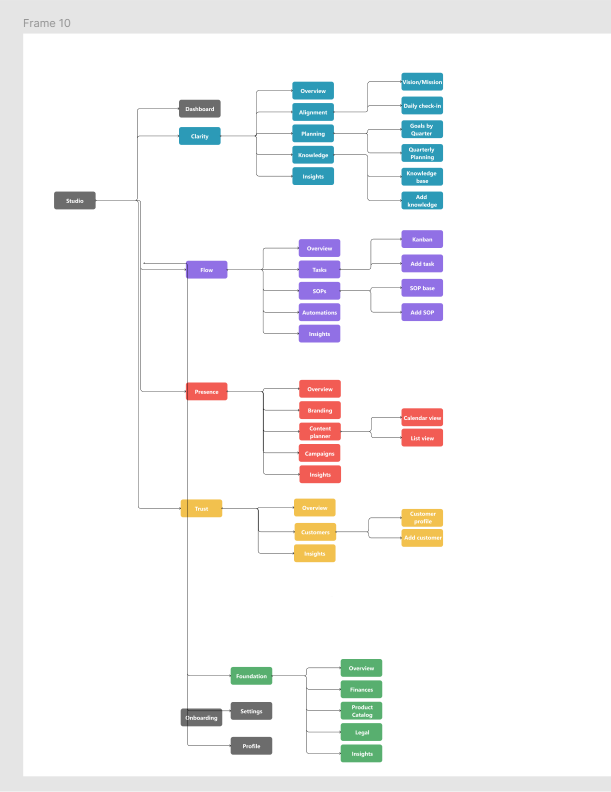 Early information architecture: every module broken down into its sub-pages before any screen got designed.
Thinking in user stories. The method behind the scope comes from earlier project management work at an agency, where I helped clients evaluate their products and take them from idea to a finished MVP in under three months. I worked close to everything product management touched, though never with enough authority to shape how those products looked or behaved. What I took from it was a tool I've used ever since: the user story.
A user story is one sentence in a fixed shape: as a [type of user], I can [do something], so that [outcome]. It sounds too simple to matter. What it does is force every feature to justify itself through a person and a result, which makes it the fastest way I know to understand what users need or want, and to tell a must-have from a nice-to-have.
What an MVP is. MVP stands for minimum viable product. You take the core features of the product, build only those, and put them in front of real users to find out whether the model you're projecting will work in the real business world. It's a test, not a smaller version of the finished thing. Everything hangs on deciding what counts as core, and that's the job the stories do.
Each story gets sorted into one of three buckets: a must for the MVP, a nice to have, or something that ships after the MVP. The sorting question is always what the story means for the user. Take signing in. Can a user authenticate with email, or with Google? That's a single user flow, and it's already a prioritization decision, because the real question is how many people will actually use Google to sign in.
The backlog. At the concept stage, before any building, I wrote the whole product as user stories and mapped each one to a feature in the mind map to understand the scale of what I was taking on. That first backlog held 76 stories: 45 inside the five modules, and 31 in the layers that cut across all of them (the main dashboard, authentication and multi-tenancy, data import and export, notifications, responsive design, design-system consistency, and pre-launch requirements). It changed many times afterward, so read what follows as the starting point, not the final scope.
| Module | Stories | What they cover |
|---|---|---|
| Clarity | 4 | Vision and mission, quarterly goals, goal progress, linking goals to Flow tasks |
| Flow | 19 | Tasks and Kanban, projects, SOPs, automations, deadlines, insights |
| Trust | 10 | Client records, pipeline stages, interaction history, auto-created projects, conversion analytics |
| Presence | 5 | Content planning, calendar, links to tasks and clients, performance |
| Foundation | 7 | Invoices, product and service catalog, tool inventory, financial health |
Flow is the largest by far, which fits, since it's where the day-to-day work happens. Three stories, as written:
- As a user, I can create tasks with titles, deadlines, and assignments, so that I track work.
- As a user, I can automatically create a Flow project when adding a new client, so that onboarding starts immediately.
- As a user, I can create trigger-based automations, so that repetitive work happens automatically.
The first is core, the kind of story an MVP can't exist without. The second is a Trust story that reaches into Flow, and stories like it ended up shaping the architecture more than anything else in the backlog. The third didn't survive as a user-facing feature.
What the method cut. Scoping meant real cuts, not filler cuts. Two of them, in particular, I genuinely thought could work.
A standalone knowledge base was one: a place to hold process documentation, vendor handoffs, anything you'd want to transfer to a collaborator or a freelancer working alongside you. It even had a place on the early site map, under Clarity. Looked at again, though, Flow already had SOPs doing most of that job under a different name. Two places to keep the same kind of information isn't clarity, it's a second inbox, so the knowledge base got cut and its value folded into SOPs instead.
User-configurable automation was the harder cut, and it's the clearest example in this whole build of the developer and the product manager in me disagreeing. That third story above is the one that didn't make it. Built out fully, it meant API access and trigger-and-action logic, something close to a built-in Zapier. The developer in me wanted to build it. It was the more interesting engineering problem by a wide margin. The product manager overruled that, because it also meant asking users to become their own systems administrators exactly where the product's whole promise was that they wouldn't have to. SimpleMark still automates plenty behind the scenes, cross-module triggers, status changes that cascade automatically, but none of it is something a user configures themselves. The trade-off was real: power users lose the ability to wire the system together however they want, and everyone else gets value without ever opening a settings panel to get it.
5. Design process
Design didn't come first here, and it didn't come last. After the data models, the backend CRUD, and a rough frontend skeleton, which was really wireframing the frontend components in code, I stopped development on purpose and went back to UX. I wireframed better screens, moved on to UI, and only then returned to frontend development. That pause was deliberate, and it was a handoff. On a team, the people who built the data layer and the backend would finish and pass the work to UX and UI designers before frontend development went any further. I ran the same handoff with myself. I stopped being the architect and the backend developer, became the UX designer and then the UI designer, and only then went back to being the frontend developer. The rest of the frontend got built on top of settled UX and UI rather than the other way around.
I'm a visual thinker, and Figma is my best friend for almost everything I make, but I didn't design the whole app in it. I designed the UI for one page, one modal, and one UI element, and reused them through the component structure in code. Design once, reuse everywhere. Every stage still fed back into the last one. A wireframe would surface that a flow made no sense; a UX pass would reveal a wireframe was solving the wrong problem.
 Most of this stage looked like this — one screen, one problem, worked through by hand before it ever reached Figma.
Early wireframes went through review passes marked up directly on the screen: what needed color, what needed icons, which screenshots didn't belong next to each other yet.
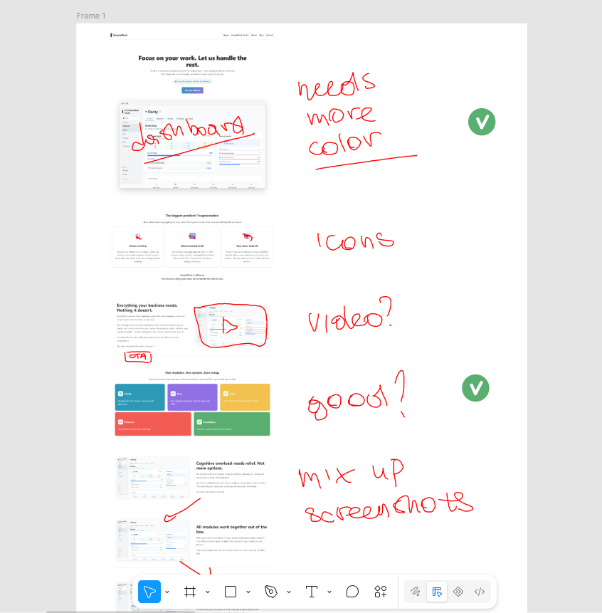 An early landing-page wireframe with my own review notes: "needs more color," "icons," "mix up screenshots." Unglamorous, but this is most of what design process actually looks like.
Once a module's structure was settled, it got built out as a low-fidelity wireframe before any visual design touched it. Here's an early pass on Clarity's schedule view: capacity, goals, and project timing.
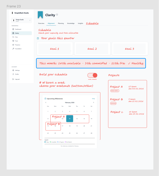 Clarity module, early wireframe: capacity tracking, quarterly goals, and a project calendar, worked out in gray boxes before any styling.
Every module shares the same base template: same navigation, same tab structure, so a user never has to relearn the interface switching between them.
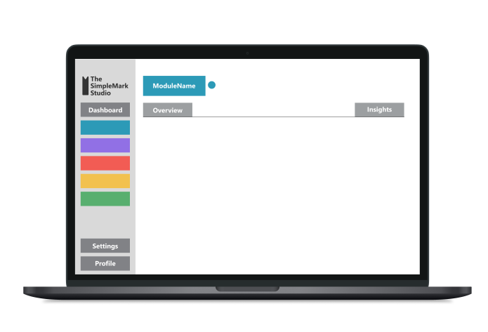 The shared template every module builds on: same sidebar, same tab pattern, different content. One layout to learn, five modules to use it in.
Components are where that reuse paid off. Here's a target-audience card, moving from a working UI component to a polished, presentable version, designed once and then used wherever the product needed it.
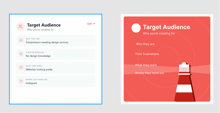 A single component taken from functional to presentable, then reused across the product.
The decision that ran through all of it: I used my own business as the live test case for the entire build. Every module, before it shipped to anyone else, had to survive being used to run my consulting work: real clients, real invoices, real strategic planning. That's either the smartest or the most reckless way to build product, depending on the week, but it meant nothing shipped that I hadn't already depended on myself.
The product also has a mascot: Markus, a cat-bookmark character, built out with a full expression sheet so he could carry emotional tone across onboarding and empty states without needing new copy every time.
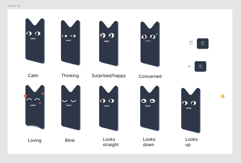 Markus's expression set. A small thing, but a consistent one: a way to signal state (success, a blocked action, an empty dashboard) without leaning on more text.
None of this happened in a separate phase before engineering started. It happened in the middle of it. The next section goes back to what came first, and what everything above sits on.
6. Technical architecture and system thinking
The stories and the mind map were built together. Mapping each story to a feature was how I understood the scale of the product, and the data models came out of that. Read as a set, the initial backlog showed three patterns, and each one drove a structural decision.
One shape, five modules. On the site map, every module is bookended the same way: an Overview at the front, Insights at the back, and the working tabs in between. The backlog says the same thing from the other side. Every Overview shows module health, key metrics, and the closest deadline, and the design-system stories ask that a user learn the interface once and find it everywhere. So a module isn't a bespoke application. It's a shared template (same sidebar, same tab pattern, its own color) filled with that module's content. That's why the wireframe template above looks the way it does, and why reworking a module never meant reinventing navigation.
The valuable stories cross module boundaries. Group the stories by what they connect and the pattern is clear. A quarterly goal in Clarity links to tasks in Flow. Adding a client in Trust creates a project in Flow. A content piece in Presence links to a Flow task or a Trust client. A tool in Foundation links to the projects and clients it supports. The main dashboard pulls critical information from every module and raises alerts on deadlines and strategic misalignments. None of that lives inside a single module. This is the point where five modules turn into one system: they share the same foundation, so the connections are built in rather than configured by the user. One action shows it best. Take Kate, a designer who runs a studio, and say she sends a client an onboarding link. Here's what happens next without her doing anything else:
| Module | What happens |
|---|---|
| Trust | The client fills in a white-labeled intake form (her branding, her questions, her availability windows) and lands in her CRM automatically. |
| Flow | A New Client Onboarding SOP is already there: ten pre-built steps from discovery call to delivery. |
| Foundation | Her services and rates pre-fill the invoice, in her brand colors and logo. One click to send. |
| Presence | A content idea she notes links to her quarterly goal in Clarity. |
| Clarity | Her capacity gauge for the month updates in real time. |
That's also where the anti-configuration principle from discovery stopped being a product preference and became an engineering constraint.
Some stories are really rules about data. A stack of stories aren't features at all. They're commitments. A user can manage multiple companies under one account. A user can invite a small team and assign different permissions. A user can import from Excel or CSV during onboarding, export all their data, and delete their account and everything in it. A user can trust that their data isn't used for AI training. Each one is a promise about ownership, and each has to be true at the database level, not just in the interface. That's what made multi-tenancy a day-one decision. Companies, users, and the join table between them are part of the first schema, and every request resolves to a known tenant before it touches data. Tenant scoping is applied automatically in the data layer, not left to each route. I'd seen what it looks like when multi-tenancy is an afterthought in a previous IT service management role, at scale, and retrofitting it into a system that wasn't designed for it is expensive and risky. Building it into the first schema avoided that retrofit.
The stack under it. The frontend is a single-page app: React and TypeScript, built with Vite, with React Router for navigation, Tailwind CSS for styling, and Headless UI for accessible components. It talks to a separate REST API. The backend is Node.js with Express, PostgreSQL, and Prisma as the ORM layer, with token-based auth, Google sign-in and Calendar, and Paddle, Resend, and Cloudinary for billing, email, and media, plus server-side PDF reports. Scheduled jobs handle recurring dashboard snapshots and emails, and Vitest and Testing Library cover unit and component tests. The frontend is hosted on Vercel, and the database and server run on Railway. I started the backend in Flask because I knew it, and I knew Python far better than JavaScript. A new language scared me, and I needed to conquer it to become a better developer. The scale of this project was also beyond anything I'd used Flask for before, so in October 2025 I rewrote the backend in Express. It was a technical decision, and it was the right architectural call.
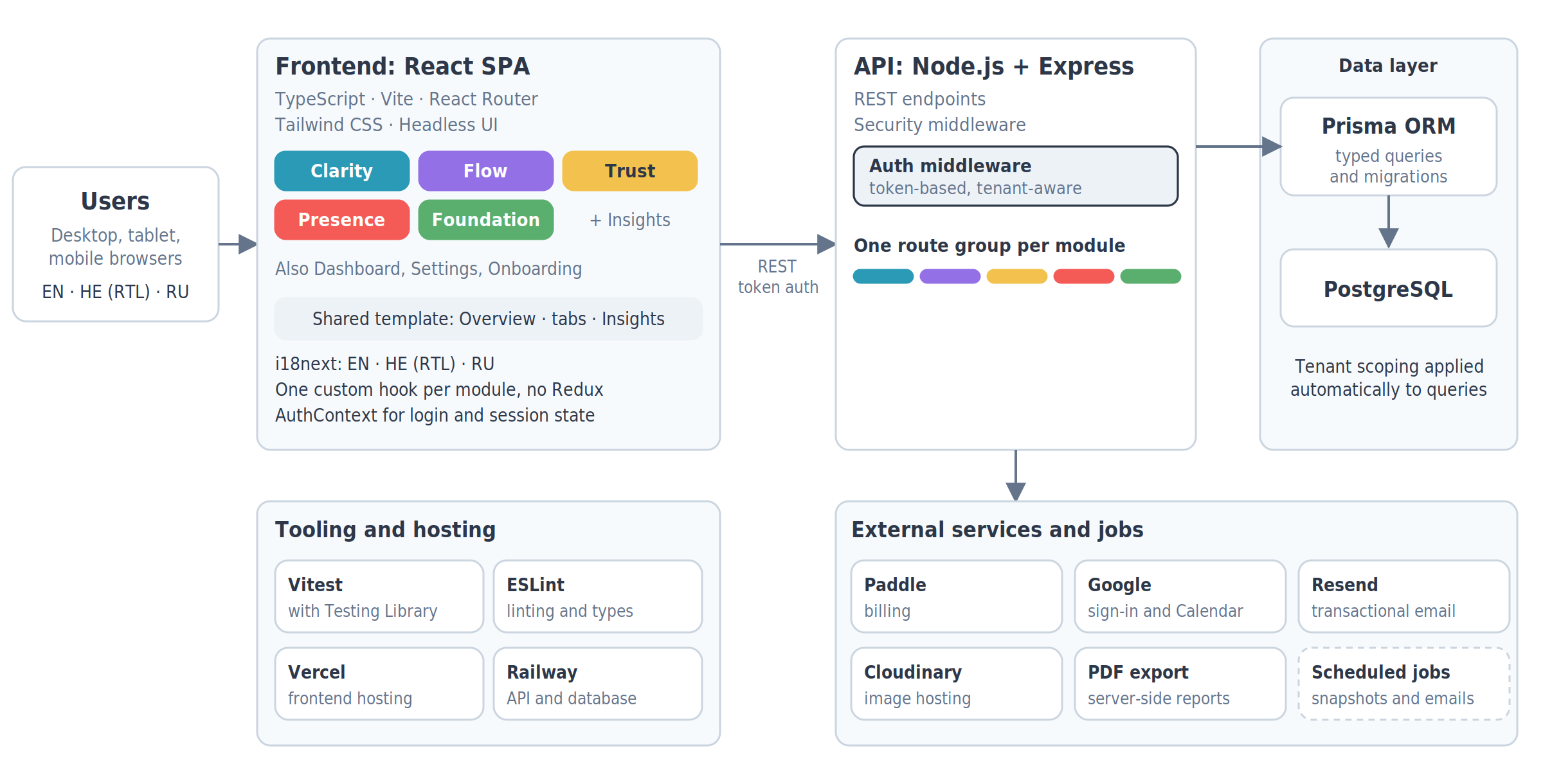 The system at a glance: one React single-page app, one Express API, one PostgreSQL database behind it, and the services around them.
State management. One custom React hook per module instead of Redux or Zustand. A global state library adds indirection that pays off at team scale and mostly costs you at solo scale. I wanted state I could hold in my head completely, not state routed through a library's own mental model on top of React's.
7. What went wrong, and what I changed
One of the first technical things I did, right after drafting the database models, was set up the database on AWS. I made that decision without the experience to make it well, assuming, because "everyone uses AWS," that it was the obvious default. I was on the free plan, and I configured it without fully understanding what I was configuring. The first time, the misconfiguration burned through all of the free credits and AWS closed the account. I upgraded and got access back, but the database was already gone: every table, every configuration. I had my local files, so I rebuilt it and reconfigured everything. I hadn't fixed the misconfiguration properly, so the next month a bill for $313.49 arrived for a couple of rows of test data. My card declined it, because the account didn't hold that amount, and I had to approve the charge manually with the bank. By then it was too late again. I hadn't created a snapshot, so both times there was nothing to restore.
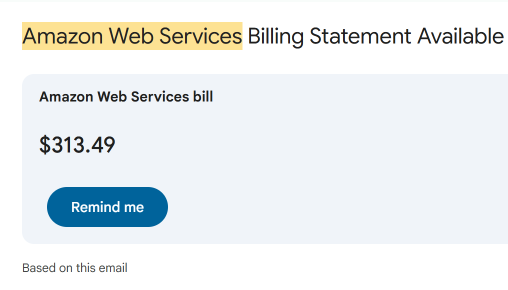 AWS Bill from my email
That failure was entirely mine, and the actual lesson is about ownership, not bad luck: I made an infrastructure decision above my experience level and didn't build in the safety net that decision required.
It was the last straw. I spent the next week reconfiguring everything on Railway and rebuilt the database from scratch, and I ended up paying roughly a twelfth of what AWS had cost, for a setup that was also more reliable for what the product needed. The technical fix was straightforward. The real change was procedural: I now treat any infrastructure decision I don't fully understand as a decision that requires research proportional to its blast radius, not proportional to how quickly I want to move past it.
There was a second blind spot, and this one wasn't caught by me. I showed an early version to my brother-in-law, who works in the medical field and has close contact with independent doctors and specialists who work with patients as contractors rather than staff, sometimes for one clinic, sometimes for several at once. He's close to exactly the kind of user SimpleMark is built for. His reaction was immediate and positive, and he wanted to pass it on to friends running private medical practices. But he couldn't. Why? Because the product was not built for someone who doesn't speak English. It had zero multi-language bones.
How come I didn't implement multi-language architecture from the start? I'd spent so much energy on whether I could finish this alone, on time, that I hadn't stopped to ask whether the product I was racing to finish would work for people in my own country. Hebrew is a right-to-left language, and for three years I'd configured BMC's ITSM software for internal customers who needed exactly that support. BMC explicitly states that it supports RTL, but the product was never fully built for it, and I watched firsthand how much harder that made it for anyone not working in English. I'd lived this problem from the other side of the desk and still didn't design around it the first time.
Once I understood what I'd actually be withholding, a useful tool kept out of someone's hands because of the language they work in, I couldn't leave it. Fixing it meant reworking the architecture for internationalization after the fact, across all 156 components and 32 pages in every module. RTL support has to come not only from text fields and inputs but from the components themselves: each button, icon, arrow, and sidebar built to appear in the right place at the right time. I translated the full application into Hebrew and Russian alongside English, plus the landing page.
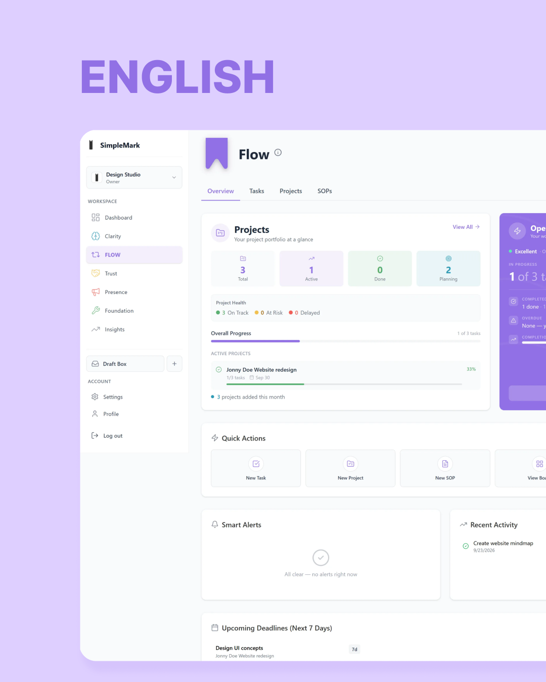
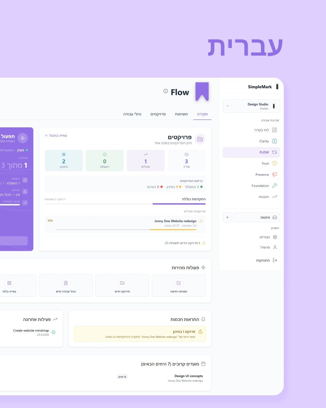
The build itself is where I used AI the way I actually trust it: not to think for me, but to remove a bottleneck I understood completely. Translating by hand, I got through two modules in two days and it still didn't sound natural. I switched to DeepL's API, a tool I'd relied on since university for Hebrew and Russian specifically, and spent about an hour writing and testing a script that ran the same translation work across the entire application in a single day. That's not the AI doing the job. It's the AI doing the part of the job that was pure throughput, so the part that needed judgment, checking that the output sounded right and catching what didn't, still went through a person, and then through QA.
8. Launch and where it stands
SimpleMark soft-launched in June 2026 and was announced publicly in July. It's functional: the same product I use to run my own business, not a "coming soon" placeholder. I'm currently doing occasional bug fixes rather than active feature development, because the core product is done in the sense that matters.
It is not yet generating revenue. I'm in an active marketing phase, running a defined 4–6 week sprint in parallel with a job search rather than treating the two as mutually exclusive. A product built and shipped solo and a product commercially proven are two different milestones, and I've reached the first.
9. Retrospective — what I'd build differently now
A few things I'd change, with the experience I have now rather than the experience I had when I made each original call:
- I'd research infrastructure choices before defaulting to the popular one. "Everyone uses AWS" isn't a reason to use AWS for a project at my stage and my level of ops experience at the time. I'd start with a simpler, harder-to-misconfigure platform and graduate up only when the product's actual needs demanded it.
- I'd trust the multi-tenant, anti-configuration instincts sooner. Both of those decisions were right, and both of them I second-guessed longer than the evidence justified once I had it.
- I'd enforce tenant isolation structurally from the first query. I built multi-tenancy in from day one, but for a while the scoping lived in each route by convention. I caught a gap while reviewing my own code and moved the scoping into the data layer, where it's applied automatically. Next time that's where it starts.
- I'd ask the language question on day one, not after a conversation with my brother-in-law forced it. He's exactly the kind of user this product was built for, and the fact that it took an outside conversation to catch a gap that big is the clearest evidence in this whole project that building alone has a real blind-spot cost, no matter how carefully you plan.
What I wouldn't change: using my own business as the test case for every module, before anyone else touched it. That decision cost me nothing and caught more real problems than anything else in the process.
I did every one of those jobs alone, with dedication and love for each, and it was the ride of a lifetime. I wouldn't regret it even if the product never succeeds. It's the joy of seeing the product come together: buttons working, screens loading fast, the database talking to the backend and the frontend. Pure joy.