Developing a dashboard for Wally's Office
I got to help Wally’s Office move from “Where is that number again?” to “Oh, there it is.” We started with a product list and sales history, and ended with a clean, responsive dashboard that surfaces the right answers fast: top products, strong regions, and revenue trends at a glance.
This isn’t a highlight reel. It’s a short, honest look at how we collaborated, trimmed the noise, and built something the team enjoys using every day.
The Customer
Wally’s Office is a small B2B stationery supplier serving offices across the U.S. They stock everything from pencils to desks and needed a clearer, faster way to understand what’s selling, where, and when. As a small business, Wally’s doesn’t have an analyst and they work primarily with Excel and CSVs in their day-to-day. Sometimes it’s hard to track the most valuable info, but they still want to see the big picture and trends. And we were here to help them! :)
The Starting Point
We began with two simple spreadsheets: product list and historical sales. Nothing fancy, just rows of orders and items. By exploring this data together, we saw the potential to answer the questions Wally’s team asks every day:
Which products are the top performers?
Which regions are doing best?
How is revenue trending over time?
The Build
We transformed those raw files into a clean, responsive dashboard that feels effortless to use:
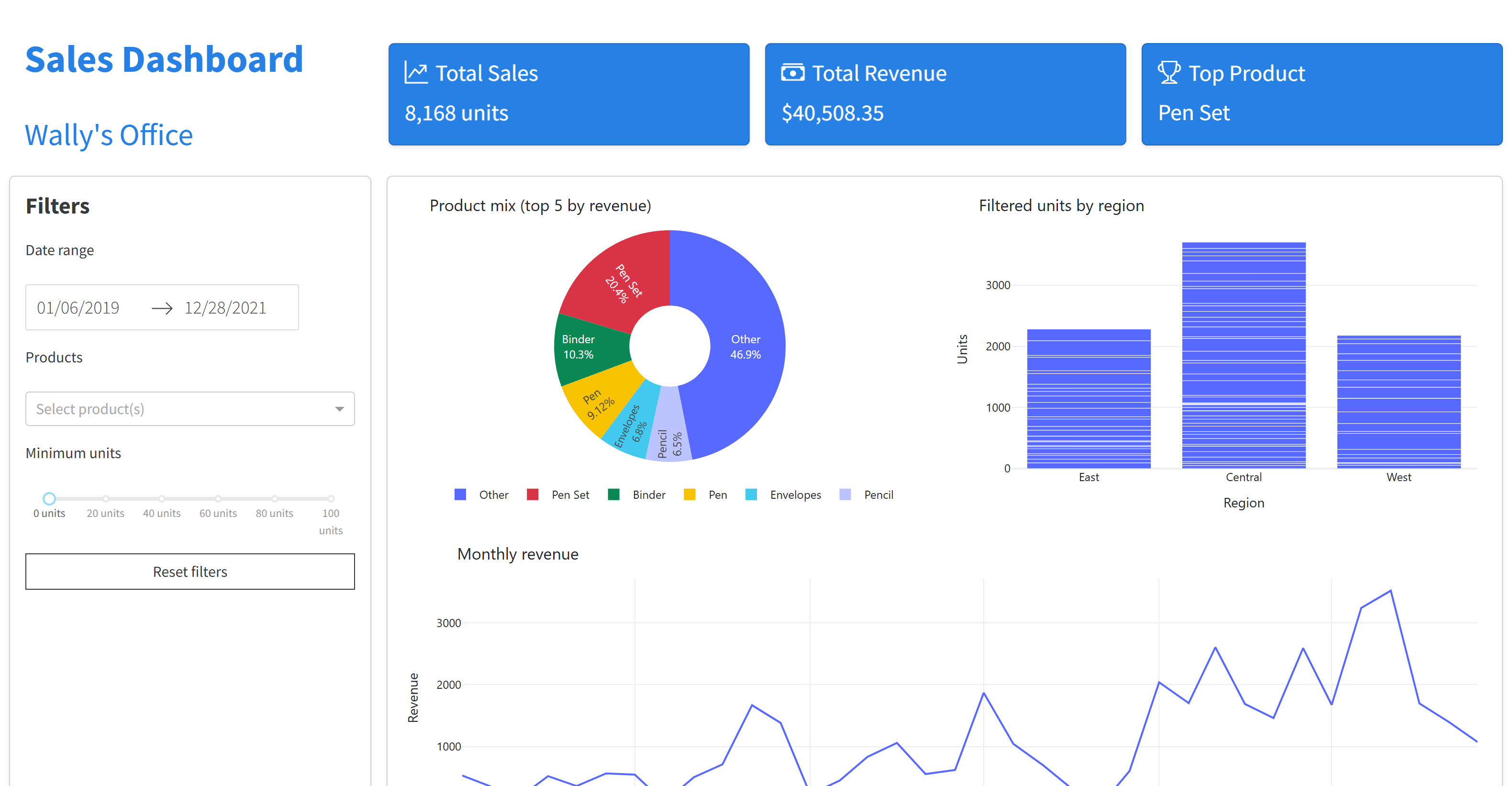
Instant KPIs front and center: Total Sales, Total Revenue, and the Top Product.
Meaningful visuals:
a Top-5 products chart that highlights revenue leaders (with the rest grouped as “Other”),
a Region performance view to spot where demand is strongest,
a Revenue trend line to see momentum at a glance.
Smart filters that match how the team thinks: by date, product, and minimum units.
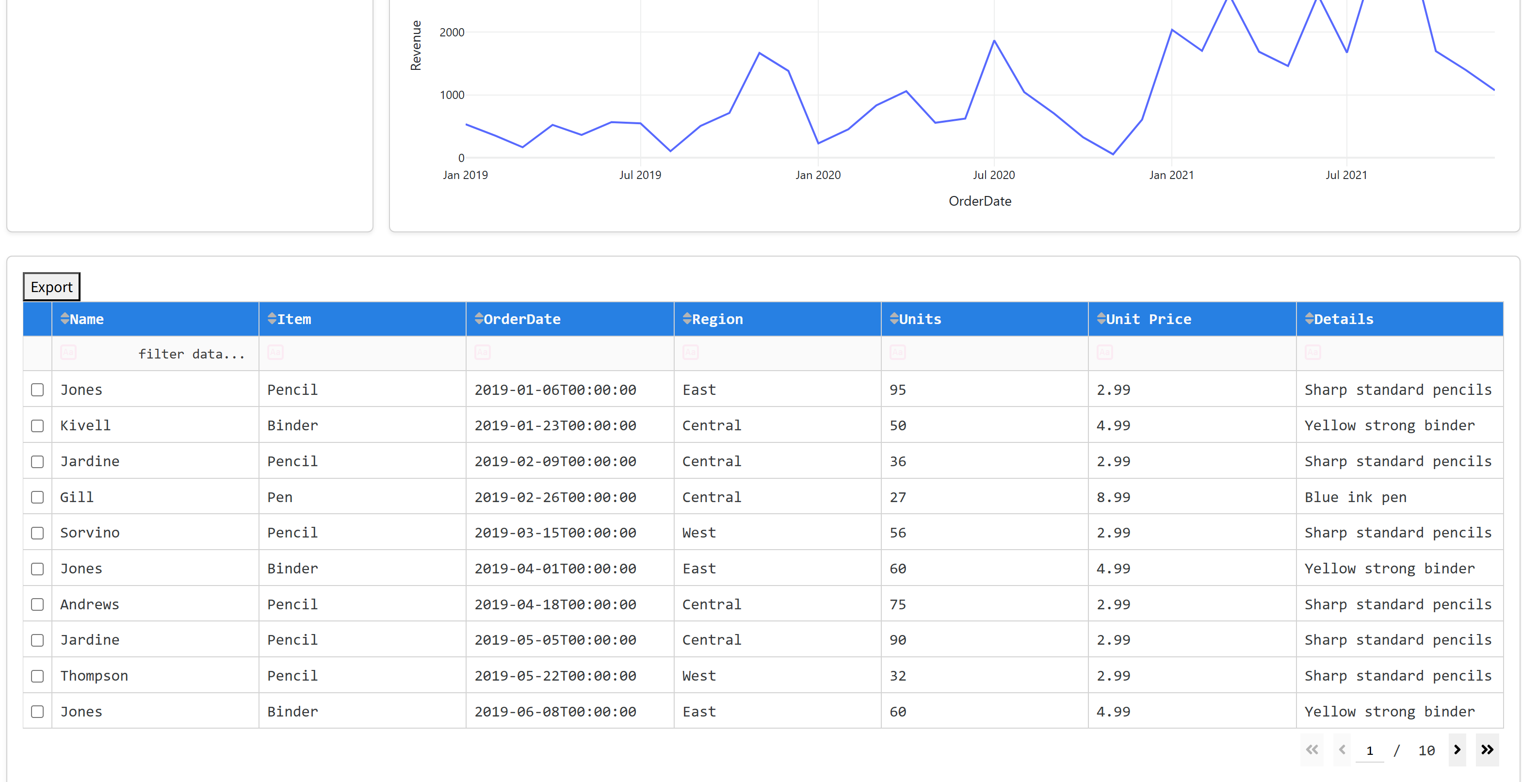
A raw data table that respects the filters and can be exported in one click.
Desigh Choices
We chose a calm, clean theme with strong emphasis on KPIs and a few subtle animations to make interaction feel lively without getting in the way. I wanted to highlight the KPIs, add a fun hover animation, and use friendly icons as quick visual cues.
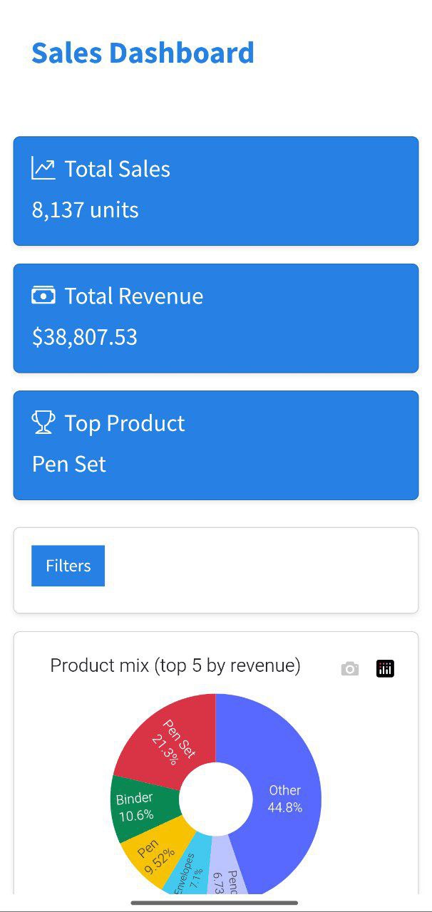
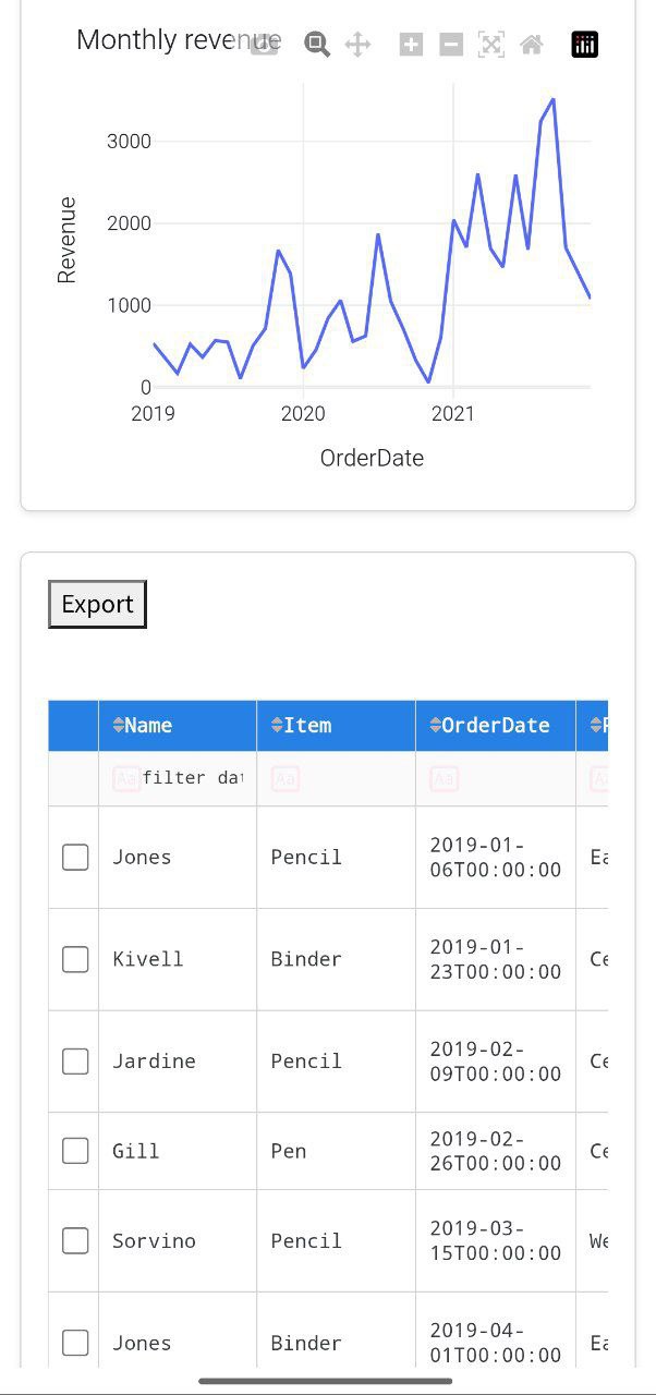
The layout adapts to tablets and phones, so managers can check performance on the go - quick and easy.
Development Environment
If you are interested in some technical details here is the drill:
I used an amazing framework called Dash (by Plotly) that lets you build beautiful dashboards using Python only! Python is one of those languages I love because of its versatility and simplicity. It lets you work with data, transform it, and find valuable insights in never-ending rows and columns. By using Python (Dash, pandas) and a bit of Bootstrap for a clean layout, I was able to develop this dashboard. The code is open, so feel free to peek and read the comments if you’d like to create something similar. :)
The Outcome
What used to be a tangle of spreadsheets is now a single source of truth. Wally’s team can:
spot best-selling products in seconds,
compare regions at a glance,
track revenue over time without manual slicing,
and export exactly the rows they need—already filtered.
It’s a simple tool that quietly upgrades everyday decisions. Overall, it was a fun, insightful project that took raw data and turned it into a living, useful interface - one that helps a growing business like Wally’s Office see itself more clearly every day. And that’s exactly what we’re here for! :)